Results Functions
The following functions are used to conveniently display and analyze data.
Function |
Section |
|---|---|
generate_report |
|
generate_sankey |
|
plot_sankey |
|
plot_bars |
Generate Report
Method Description:
This method identifies the type of model: [strategic, operational], creates a printing list based on is_print, and creates a dictionary that contains headers for all the variables that will be included in an Excel report. The dictionaries are used to create separate excel sheets which categorize the data by variable name or type. This same data is put into excel sheets named after each variable as well as an overview sheet which contains totals and Key Performance Indicators (KPI) information.
Warning
If an indexed variable is added or removed from a model, the printing lists and headers should be updated accordingly.
The output of this method prints out each variable’s information in the terminal as specified by the user, as shown below.
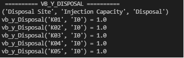
Figure 1. Example of Terminal Output
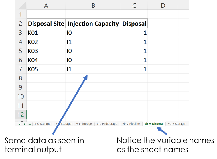
Figure 2. Example of Excel Output
How to Use:
This method requires two parameters:
1.) The model that is being returned from the create_model() method after a solution is found
2.) An array of an “enum” class value specifying which variables to print which are chosen by the user. These values are:
“PrintValues.Essential” – Specifies that the overview information will be printed
“PrintValues.Nominal” – Specifies that all information from PrintValues.Essential + Trucked, Piped, and Sourced water information will be printed
“PrintValues.Detailed” – Specifies that all information including slack information will be printed
Example of how this method is used:
strategic_model = create_model(df_sets, df_parameters)
results = opt.solve(strategic_model, tee=True)
[model, results] = generate_report(strategic_model, is_print=[PrintValues.Detailed], fname="..\\..\\PARETO_report.xlsx")
Generate Sankey
Method Description:
Sankey diagrams are a graphic tool used to easily visualize supply-sink flows across a given infrastructure (source/destination). The relative width of each “flow” is proportional to the amount of water that is being transported between locations. Such diagrams are commonly used to visualize the complex nature of money, energy or material flows.
This method receives the final lists for source, destination, value, and labels to be used in generating the Sankey diagram. It also receives arguments that determine font size and plot titles. The user can save the Sankey diagram in the following formats: jpg, jpeg, pd, png, svg, and html. Html format is set by default.
How to Use:
# Creating links and nodes based on the passed in lists to be used as the data for generating the Sankey diagram
  link = dict(source=source, target=destination, value=value)
  node = dict(label=label, pad=30, thickness=15, line=dict(color="black", width=0.5))
  data = go.Sankey(link=link, node=node)

  # Assigning sankey diagram to fig variable
  fig = go.Figure(data)
  fig.write_html("first_figure.html", auto_open=True)
Plot Sankey
Method Description:
This method receives data in the form of 3 seperate lists (origin, destination, value lists), generate_report dictionary output format, or get_data dictionary output format. It then places this data into 4 lists of unique elements so that proper indexes can be assigned for each list so that the elements will correspond with each other based off of the indexes. These lists are then passed into the outlet_flow method which gives an output which is passed into the method to generate the sankey diagram.
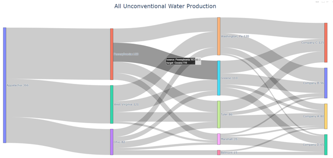
Figure 3. Example of Sankey Diagram Showing Water Production Flows
How to Use:
This method requires two parameters:
1.) An input data dictionary that includes the time periods requested as well as said data. The data is passed in as ‘pareto_var’ and can be in get_data() format, which requires labels, generate_report() format, or 3 separate lists:
“pareto_var” – This parameter can be variable data returned from the get_data() or generate_report() format
“time_period” – This is used to specify which time periods from the data that the user wants shown in the diagram. If the user passes no time periods in, then all time periods are used in the data.
“labels” – This is only required if the data being passed in is in get_data() format. The labels are used to distinguish between the columns.
2.) A dictionary of arguments that include formatting options like font size, title of the plot and output file:
output_file – This parameter is used for creating the file that contains the Sankey Diagram created by this method
Example of how this method is used:
args = {"font_size": 15, "plot_title": "Completion Storage", "output_file": "..\\first_sankey.png"}

input_data = {"pareto_var": df_parameters["v_f_Trucked"]

                "labels": [("Origin", "Destination", "Time", "Trucked Water")]}

plot_sankey(input_data, args)
Plot Bars
Method Description:
This method generates a bar chart based on the variable data that the user passes in. It automatically creates either an animated bar chart (if the variable is indexed by time) or a static bar chart.
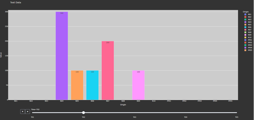
Figure 4. Animated Bar Chart
How to Use
This method requires two parameters:
1.) A dictionary including the data and labels that are being used, either in get_data() output format or generate_report() output format. (Labels only required for get_data() format).
“pareto_var”– This parameter contains the data that the user wants to use
“labels”– This parameter contains the labels for the data provided
2.) A dictionary of arguments that include the title of the plot, a group by parameter, and an output file. Here is an example of the arguments:
“group_by” - This specifies what field will be used as the x axis in the plot
“output_file” - This parameter is used for creating the file that contains the Bar Chart created by this method.
“y_axis” - This specifies if the user wants to take the logarithm of the y axis. If not provided, then the y axis remains the default(linear).
Example of how this method is used:
args = {"plot_title": "Completion Storage", "y_axis": "log", "group_by": "Destination", "output_file": "first_bar.html"}

input_data = {"pareto_var": df_parameters["v_f_PadStorage"]

                "labels": [("Completion Pad", "Time", "Storage Levels")]}

plot_bars(input_data, args)